Twarda Oprawa
Brand strategy and visual identity design for a self-publishing consultancy from Poland.
Project team:
- Alex Minkaczbrand strategy, consulting, creative direction, graphic design
About this project
Kinga Rak is a publishing consultant, an editor, coach and mentor. She helps independent writers publish their books, either through a publishing house, or just by themselves.
I met Kinga at Katodesk just as she was starting to build Twarda Oprawa (English translation: Hardcover). It’s an evolution of her business model that moved her from a one-man-army type of work to an actual company. The name’s also a pun on what it’s like to work with her. It’s far from easy. But it gets results.
To move forward, she needed to think through everything concerning the new brand. What is the Twarda Oprawa brand all about? What should people feel about it? What should the words and visuals communicate?
She asked me to help her figure it out. And boy, did we do that!

Consulting
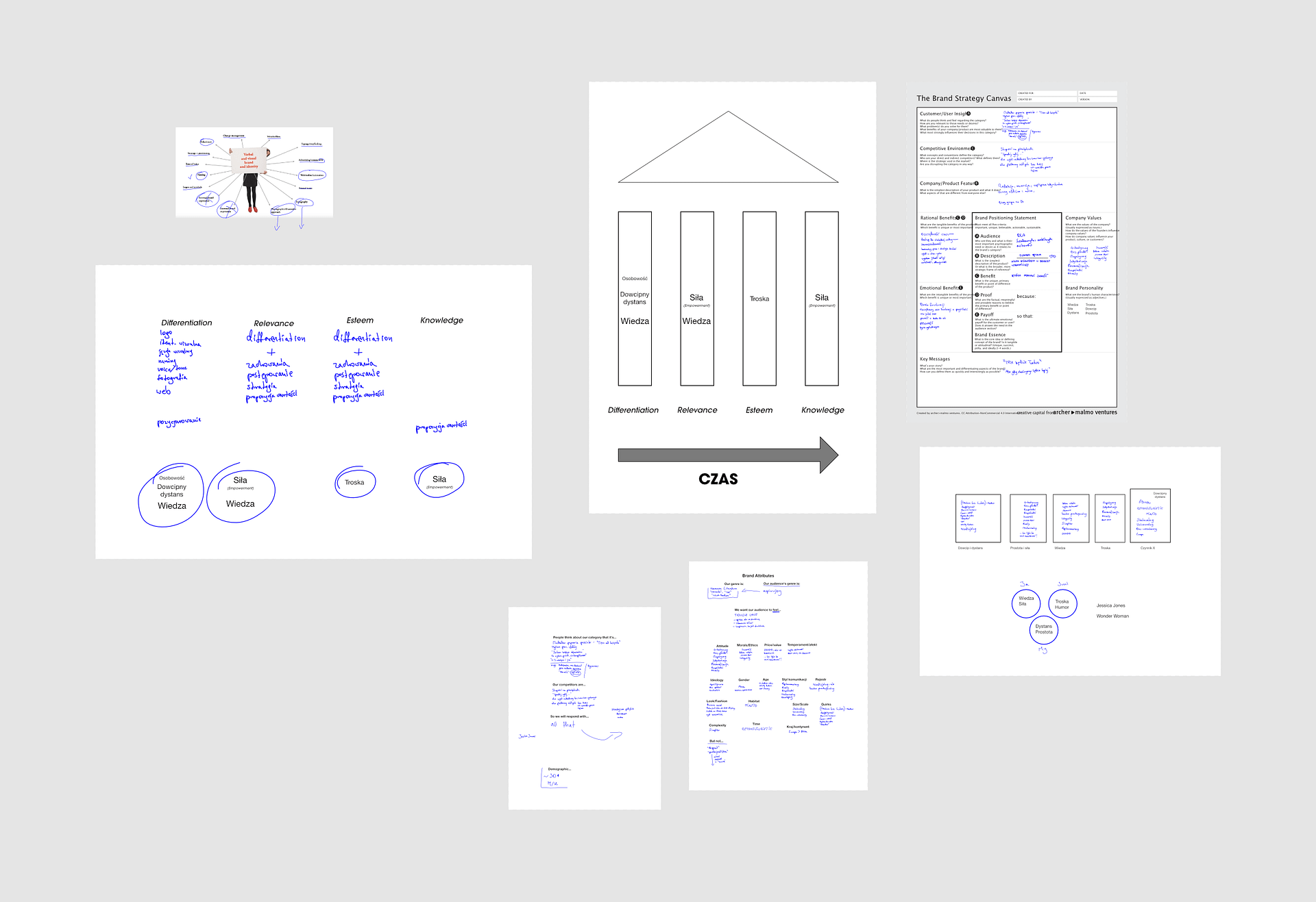
There are so many things one has to think about when creating a new brand. It’s hardly about the product and the logo anymore. Meaning is the name of the game.
Today one has to think about the emotions you’ll evoke, the symbolic level, archetypes, value proposition, signalling and much more.
Fortunately Kinga was a very engaged and decisive workshopping partner. It took us three short sessions to arrive at a satisfactory input for a brand brief that she’ll be using for the forseeable future.
The creative process
After we decided on the meaning part of the brand, it was time to design the signifier.
In other words, the logo.
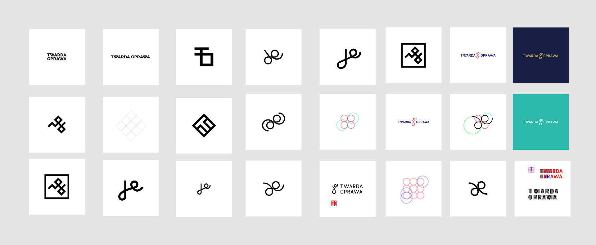
We went through many different ideas, some based around the proofreader’s mark for deletion. It’s about the way Kinga works. Get rid of anything that’s superfluous.
Still, we didn’t find any idea good enough. Twarda Oprawa is supposed be a premium-ish brand, and embellishing it with squiggles just doesn’t cut it.
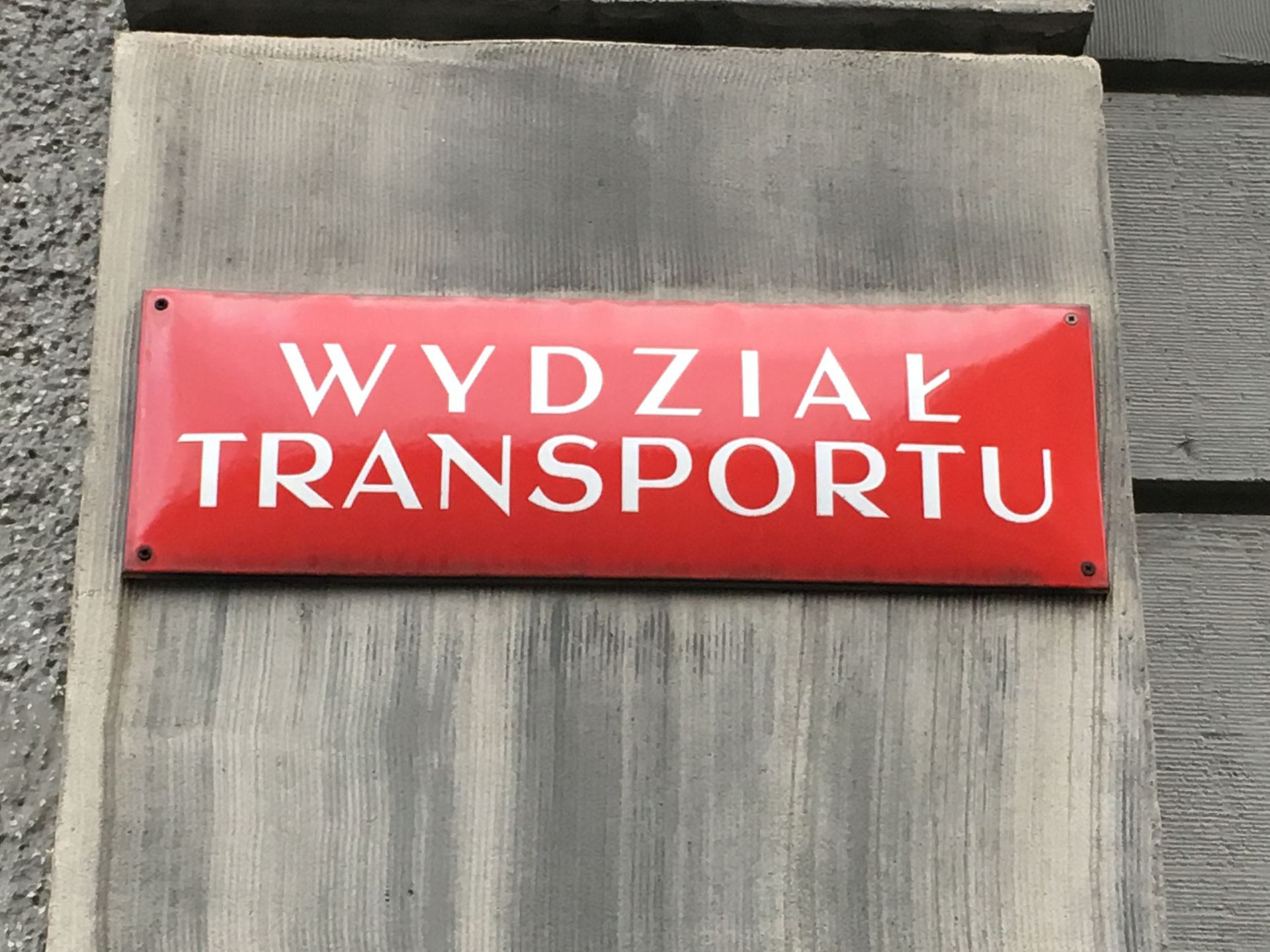
One day, when coming back home, I stumbled upon a small sign for Silesian University of Technology’s Department of Transport. It caught my attention with its art-deco typography that’s elegant yet lively, aggressive yet classy.
I immediately suggested to Kinga that we do something similar. She was totally on board.
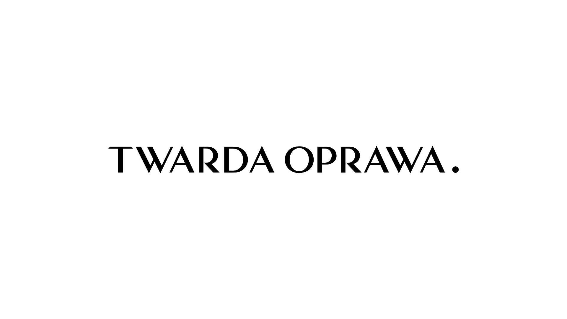
The font used on this sign turned out to be a long-forgotten typeface designed for public institutions in the beginning of the 20th century. I found the master stencil somewhere in the depths of the internet and based the new logotype on it.
See how it turned out below.
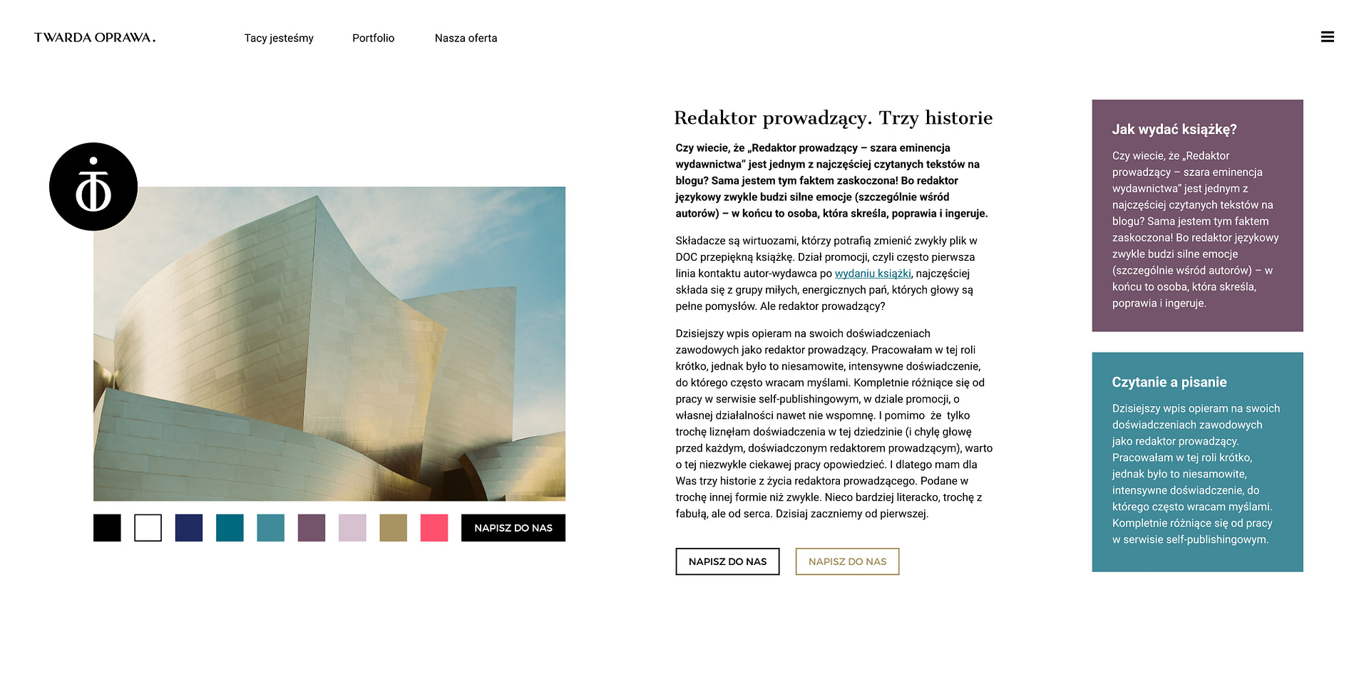
The design

Would you like to learn more about this project?
I’ll be happy to share the whole story – get in touch.
See this:

Aperture Insights
Branding for a customer intelligence company and a management consultancy from London.
“Simply one of the best, most rounded and helpful designers I’ve had the privilege of working with.”
Phil Lewis
Managing Director
Corporate Punk
“He’s a fantastic listener and communicator. He really understood our needs and documented them all out for us to see.”
Hunter Bailey
CEO
Siren
“Alex was a pleasure to work with. He is pro‑active, creative, passionate and thorough in his design approach.”
James Lahren
CEO
PerformX
“He is a very precise, highly professional expert. He adapted very swiftly to our needs and proposed well structured solutions.”
Gyorgy Folk
Editor-in-chief
Civil Liberties Union for Europe
